What good is a landing page that doesn’t convert? It simply nullifies the whole purpose of having one in the first place. The power of your landing page lies in its perfection that comes over time.
You ought to work on it until it becomes the perfect tool to engage your potential clients, convince them, and convert them!

Targeting one such landing page? Here are a few tips you wouldn’t want to miss to get that:
1. Clear offers
A client will respond to an offer he’ll understand completely. Until he has any doubts in his mind, he’ll not agree to pay up. Hence, it becomes essential to make sure your offers are clear with understandable language.
The client must feel good while taking you up on your offer and most not have any doubts about it. He must feel that it’s a smart and wise decision that he feels good about.
2. Simplify your landing page
Except for the content, there’s a whole world of elements on a landing page. It’s extremely important that it looks systematic instead of looking like a cluster, piled upon each other.
It falls upon the designer to find the perfect place for every element.
3. Gripping to a color theme
It’s very often that we find color themes becoming brand identities. We see red and yellow, we immediately connect it with McDonald’s. That’s exactly what happens by sticking to colors.
The composition of colors on your landing page somehow represents your brand identity and lets the consumer relate to you. Every important element should look like it belongs to you.
4. Don’t divert the focus
If a person has reached your landing page, he has already shown interest in your offer. After that, mention of anything else might confuse him. The first thing he has to see on the landing page is the offer he came for. He needs instant assurance that he is on the right page.
Don’t we always focus on the main part? That’s exactly what we need to do with our landing page. Once he sees the offer he’s there for, he can scroll down for more information on it.
5. Use scarcity techniques
Didn’t you just attend that sale that’s ending in 2 days? Thank God you didn’t miss it!
That’s the urgency you need to create on your landing page. The client doesn’t have to feel that he can come and avail of the offer at any time. He needs to know that he might just miss it.
Words like ‘Hurry up’, ‘Limited period offer’, or ‘Only for 10 first applicants’ might do the trick for you.
The mention of scarcity on an offer will turn it into a magnet and will create urgency among the clients to avail of it.
6. Straight forward Call-to-action buttons
Call to action buttons is where they actually convert. Those are the elements that lead them to take up your offer.
With such importance, they can not be confusing in any way. They have to be as clear as a crystal. They must state the offer clearly without creating any questions in the head of the audience. They should make it very simple for them to avail of your offer.
7. Contact details
It’s very essential that your potential clients know how they can reach you. There are various options to be used. Email address, social media links, contact number are some of the very common ways used.
Providing such details will not only give them a way to connect with you, but it will also establish a sense of trust in you.
This is a tip you cannot miss.
8. Don’t settle with headlines or content
What lets a person click on a simple link? It’s an intriguing headline that doesn’t let the person ignore it.
If that’s the case( which it is), why would you settle with a headline that doesn’t assure creating much interest for the audience to visit your page? That would be a huge mistake.
You must have various options while deciding upon a headline and go for the one that is the most intriguing.
But when a person reaches the page, it’s not just about what’s written. It becomes about how! Make sure that it connects with your target audience.
9. Be consistent
A person might reach your landing page through a Facebook ad, a LinkedIn post, or any email. If he doesn’t find any similarity between the landing page and what led him there instantly, he might get the idea that he’s in the wrong place.
You have to be consistent with how you present your offer on various platforms. There should be a similarity between the elements used on every platform.
In simpler words, it should create a similar visual impact on every platform.
10. Add proofs of your worth
10. Add proofs of your worth
Whenever we go to a restaurant, we always check its reviews to see if it’s worth it or if it serves our favorite cuisine. It works the same for your clients.
Tokens of appreciation from your existing clients will serve as pieces of proof for them. It’ll lead them to feel confident about you and your offer. They’ll definitely feel that your offer is worth paying the money.
With many creative ways to put up testimonials, you can decide which one suits your need the best.
If you are not sure, you can get a review by experts at The Dreamer Designs.
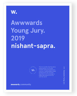
Get your website audit done for FREE by a member of Young Jury at AWWWARDS

If you are not sure, you can get a review by experts at The Dreamer Designs.
Get your website audit done for FREE by a member of Young Jury at AWWWARDS
Ways you can reach us
We are all ears if you wish to get in touch. Here are several ways you can get in touch with us. We are waiting to hear from you
 Skype: thedreamerdesigns
 Whatsapp: +91 9811 725 067
 Email: nishant@thedreamer.in
 wish us to reach you?: Fill in this form


