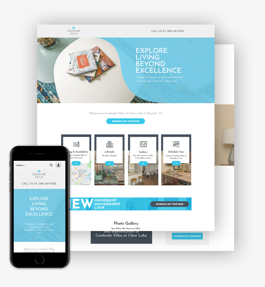
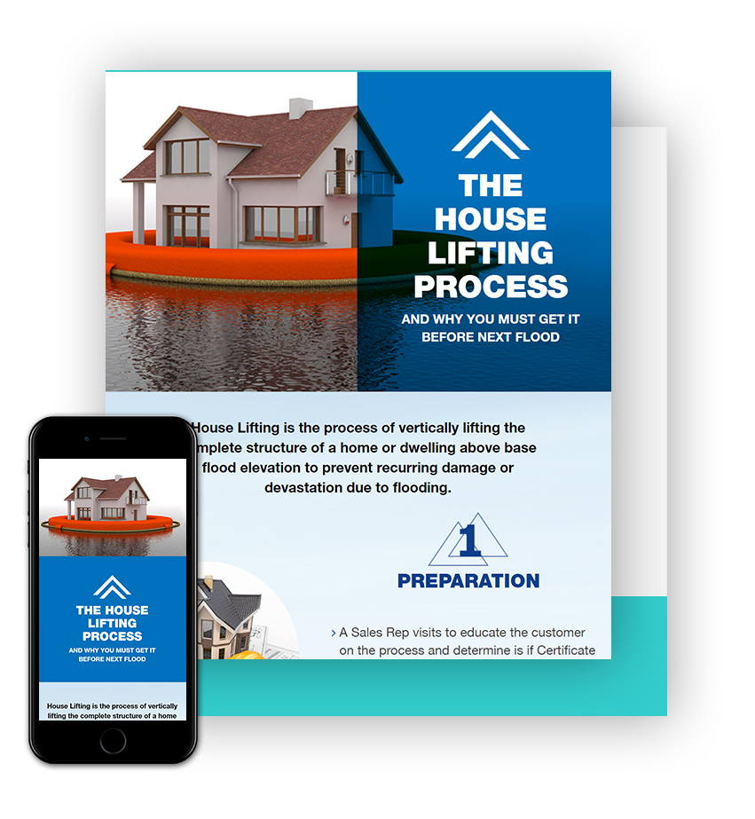
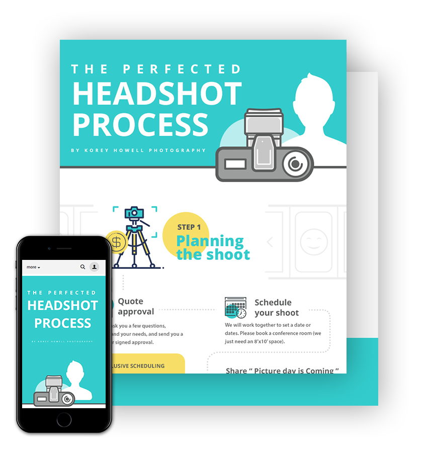
Infographics have been a big part of our offerings but now it got even bigger. We are now providing infographic design services to Microsoft as our client. Not only we did deliver in time but also got this testimonial from client” Really solid work, he was very responsive and was attentive to details throughout our project. I’d work with him again.”
After designing more than 1000 infographics and counting we have found a secret sauce recipe for making an infographic awesome and effective. I will try my best to make this article best suited for experienced infographic designers and beginners alike.
Let’s know what the term means. Info graphics is basically the easiest way to understand and communicate. The presentation of information in form of graphics, images, and designs is known to be Info graphics. Info graphics not only deals with mere information in written form but it presents the data in such a way that it gets easy for the layman to understand and grasp the knowledge.
Now let’s know how a standard Info graphics work:
Header-
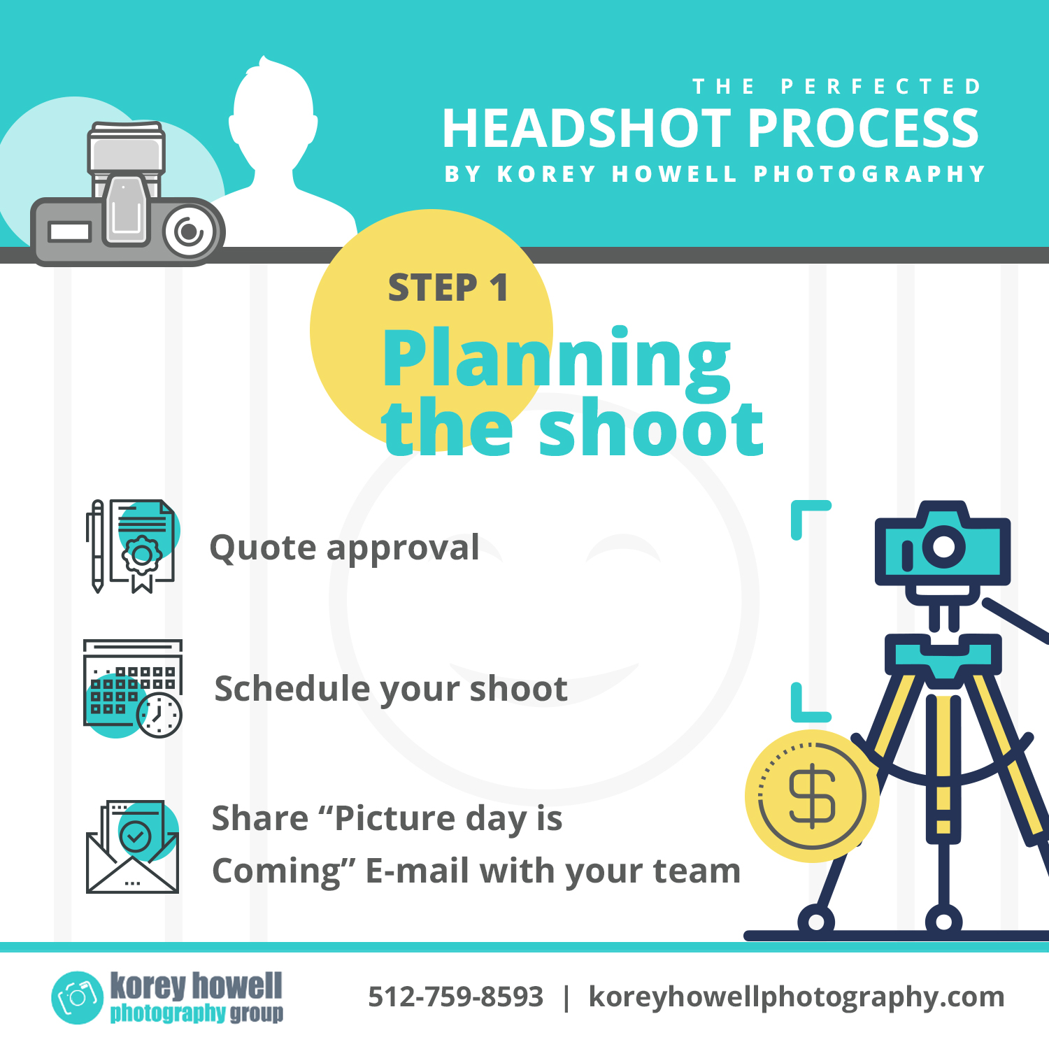
The main part of the Info graphic is a header in which the title is written. The focus of the person working on Info graphics should be that, the title is bold, stylish and should be attractive and have a little text supporting the title. The title is the foremost part of Info graphics and should be written and designed with utmost care. Here’s an example below of how a title with text should be written.
Body-
Then comes the body or the content part of the graphics which gives the main information and data. It is very important to keep in mind that the text in the body part should be limited to the main data. The text should only have 15-20 words.
The data in percentage, digits and important facts can be written in bold font or in a way that they get highlighted. The percentages and similar data need not be limited to traditional graph styles like pie diagram and charts but can creative direction based on topic.
Here’s an example of how the facts in digits and percentage are written in bold fonts or you can also show the information in an unique way just like it is shown in the image below. Showing 25% of the branches of the tree empty.
The body of the graphic can also have segregating elements related to the topic which can further give information related to the topic. The segments should be designed in such a way that it relates to the topic and yet look attractive to the reader/client.
For example in the image above the text in the graphic for “beautiful beaches”, the segment is divided by waves because it relates to beaches.
Here is another example below which clear your doubts of how important it is to give relatable segments to the graphic.
Footer-
TLast bit of a static Info graphic is footer which can have links to information sources and branding of client. The sources part is generally less prominent than overall graphic. In the picture below you’ll see the example of footer. The black section in bottom section which contains the sources, name of the company all comes in the footer part.
These were some of the main steps and key points to be kept in mind while working on a static Info graphic. Apart from this there are various types of graphics like GIF-ographics.
GIF-ographic is a level higher than Info graphics which makes the graphics look more professional and yet eye-catching. It is more like an animation with graphics and designs and facts. A GIF-ographic is SEO friendly and attracts more audience.
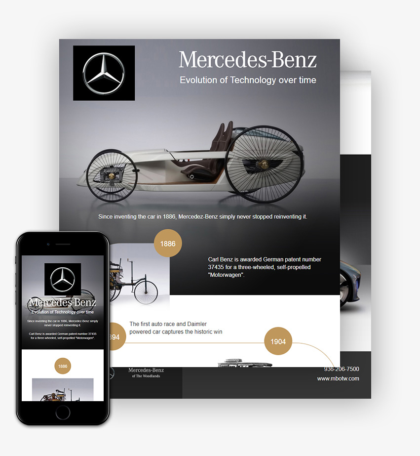
Info graphics can also be designed in a way that they adapt to responsive environment and they are generally called as web-based Info graphics. Web based IFG are made using HTML.
It’s not over yet, Info graphics also helps you to create a new resume. Long gone the days when CVs used to be boring. Info graphics adds so much that makes your resume appealing at first glance itself.
Below is an example of a resume made with the help of Info graphics. You can more attractive resumes using Info graphics.
In a world of bigdata and facts where every detail is important and valuable, Info graphics, is the new trend in world of graphic designing.
The other day I sent one of the infographics I designed, to a friend of mine and he happened to open it up on his phone. As I thought, he simply hated it. On his phone, he could not understand a word of it, as the image appeared too small. The way infographics are designed in the industry, they are not responsive and with the world going mobile, infographics are losing their charm. Once they ruled the industry as visual information is better understood than the textual one, but the times have changed.
What if it could be changed. What if your infographics could adjust to screen size? The possibilities will be endless. What if the same visual appeal can be carried irrespective of the screen and resolution used?
The second biggest challenge or as Marketing Guru Neil Patel rightly mentioned in his post: https://www.quicksprout.com/2017/07/21/heres-how-to-perfectly-optimize-your-infographic-for-seo/
The article reads like” Let me start by saying infographics are technically just images. They are typically saved in image formats such as JPEG, PNG, GIF, etc. Of course, they’re much more robust and contain far more information than a regular image, but that’s how Google views them. This is important to know because Google can’t “read” images like it can text-based content such as a blog post. ”
Now there is a solution and that too without breaking a bank. With HTML based infographics we are able to solve this age-old problem with infographics while ensuring that they are stunning to look at and yes, they are SEO friendly as well. Majorly all the text included is crawlable by search engine crawlers. It can have HTML tags like H1, li etc. The infographics we design in this category are mobile responsive and can have animation as well. We have successfully implemented these infographics on WordPress based websites as well. Moreover, they are much lighter on the page than a big image or a gif.