Category

Crowdfunding Infographic

How to run a successful crowdfunding campaign?

By Crowdfunding Infographic, Infographic

Crowdfunding began in churches, where a basket would be passed around and funds would be collected for some greater good. Fast forward to the age of the Internet, where crowdfunding campaigns gained popularity and appealed to a larger community for funds. It became easier to find a crowdfunding campaign that you truly believed in and wanted to support. With multiple platforms like Kickstarter, Indiegogo and more, launching a crowdfunding campaign became easier. Gaining support, however, got tougher. 

With increasing number of crowdfunding campaigns, the fight to gain page views and pledges has become difficult. This is especially true for platforms that have thousands of campaigns competing against each other. To run a successful crowdfunding campaign, you need to identify some of the best techniques, marketing strategies and trade secrets. Passing along a basket won’t be enough. 

To run a successful crowdfunding campaign you need an impactful storyline that stands apart from the crowd. It must be something that catches the attention of users and pushes them towards taking action. However, most crowdfunding platforms have a lot of text and design limitations. The only way to beat them and ensure that you stand out, is to invest in Infographics. Infographics can be uploaded onto crowdfunding platforms and can be used to attract the attention of users and make them take action. Listed below are ways in which you can enhance your crowdfunding campaign, use multiple platforms to gain an audience, highlight your brand, tell a compelling story and more, by inculcating infographics in your crowdfunding campaign.

Use visual elements to leave a lasting impact on your audience

According to research, humans are visual creatures and tend to remember and recall visual elements far more easily than words they read. If your aim is to leave a lasting impact while competing against thousands of crowdfunding campaigns, you must stand out. Infographics are striking and can visually tell a story. Another reason for using infographics instead of just text on any crowdfunding platform is to skip endless limitations. Most crowdfunding platforms are restrictive of formatting. You may not be able to change the font type or size of the text explaining your campaign. You may also not be able to add bullet points, change alignment, shuffle text placement, and more. A lot of these formatting limitations take away from the story you want to tell. This is where infographics can help. You can do anything you like with your infographic and not worry about design or formatting limitations. Create an infographic, upload it on to a crowdfunding platform, and you’re good to go!

Present your data via graphs, charts, pictures and tables

Crowdfunding campaigns are the opposite of mainstream business finance. Instead of pitching your idea to a limited number of individuals with money, it allows you to present your ideas to people from all over the world. Crowdfunding platforms allow entrepreneurs to share a pitch with interested parties, offer them investment options or other rewards. To get an audience to understand your idea, you need to create a pitch that doesn’t bore your audience. Infographics are great because they allow you to add elements like graphs, charts, tables and pictures in a fun and creative manner. They allow you to breakdown financial jargon into easy-to-understand data that can be understood and acted upon by your audience.

Tell a compelling story to build trust

Online crowdfunding campaigns give you just over a few seconds to leave an impact. Can you do that with just words? Maybe not. The truth is, you need to be different from compelling pitches, creative ideas and heart-wrenching stories. To run a successful crowdfunding campaign, you have to tell a story that makes your audience pause and notice. With the help of infographics, you can keep in touch with your supporters and inform them of your project’s progress. This will help build a long-term relationship and transparency will help you gain trust.

Gain a presence, everywhere

Don’t limit your crowdfunding campaign to just crowdfunding platforms, use the power of social media to gain more supporters. What’s more? If you go the infographics way to launch your crowdfunding campaign, you don’t require any other material for social media. Infographics, once created, can be shared on social media platforms, and they have a history of going instantly viral! You can create multiple infographics, test which infographics work best for you and your project and then launch the same on crowdfunding platforms. This will allow you to gain the maximum traction and help you run a successful crowdfunding campaign.

Conclusion

The secret of running a successful crowdfunding campaign is very simple – impact. If you have a compelling story and the ability to make an impact, you can run a successful crowdfunding campaign. Infographics are one of the most popular mediums via which you can grab the attention of a user. If you can use infographics to present your story, chances are you’ll reach your campaign goal, far quicker. We know this because we have been creating infographics for a while now, and have created successful crowdfunding campaigns for clients like Bomfy B, Noveli, Reach App and more. To get in touch with us, The Dreamer Designs, please click here.

HTML Infographic for Mercedes Benz

8 Things that You Must Not Miss when Hiring an Infographics Designer

By Animated Infographic, Crowdfunding Infographic, Html Infographic, Infographic, Interactive Infographic, Static Infographic, Video Based Infographic
8 Things that You Must Not Miss when Hiring an Infographics Designer

The infographic design space has been part of a major evolution and is one of the most time-tested ways of delivering your message to various audiences. Infographics mainly comprise of visual clues to communicate the intended message while ensuring that it stays relevant to the topic.

But before you join hands with the Infographics revolution and get added to the list of people being benefited by the extreme communicative power of this tool, it is essential that you hunt for the right infographic designer for your business. Listed below are a few but crucial things to look out for when hiring an infographics designer:

  1. Purchased Images

The designer should use licensed vectors and images in order to avoid copyright issues which can cost you tons. Most designers use images from so-called “free” websites like Freepik and use an image like the one in the below example. However, the detail that they miss is that attribution is required for using this image. This can lead to serious trouble if your infographic goes viral. Which exactly is the purpose behind designing it!  

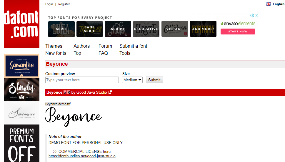
Same is the case for fonts where infographic designers use fonts from sites like Dafont which provide some fonts for free but for personal-use-only license. It should be ensured that the designer is willing to share the licenses for all fonts, vectors and images used while ensuring that all assets used are good for commercial purposes. You really don’t want your infographic to be a matter of worry and legal issues when you have already displayed it on your platform for the world to see!

  1. Variety of Styles in Portfolio (flat style, process-based, data-based)

Infographics can be designed for a variety of purposes. You can ask an infographics designer to create an infographics resume , to illustrate a process , or to simply provide information about a product  or a service . Infographics can also be used to list down the top 5 – 10 USPs or so of a particular product or to compare two similar things visually.

Infographics can not only be created for a variety of purposes but also in a variety of different styles. To give you an idea, Flat Style Infographics  provide good quantity of content at a low price making them perfect for when you want to only provide information. Image based infographics. on the other hand are good for product based infographics and for more professional industries like the medical, finance etc.

Although there is no fixed-style for an infographic, the designer should know what style will help bring in higher conversions. Infographics that resonate with the target audience tend to bring in higher conversions, something that your infographics designer should be well aware of. Along with that, the design should complement well with the overall style of the brand or product that he/she will be representing via infographics.

  1. Ability to Level-Up Infographics When Needed (animated, interactive, responsive infographics)

Did you even know there is more than jpeg images when it comes to infographics?  Your designer created an infographic, shared it with you in a jpeg format, you posted it on social media and mostly received a positive response. However, you also got feedback that the infographic could have been more interesting but alas, you don’t know what to do with this excellent piece of information. Worry not!

There are several options that can be used to level-up your infographic and these options should be your designer’s first go-to. You can reuse the infographic with animation  and make it mobile-friendly. Yes, there are ways in which you can make your infographics mobile responsive and SEO-friendly ! If in case you have a content-heavy infographic, you can repurpose it for social media by converting it into social cards . Your designer should be able to help you scale-up and extract maximum out of your infographic.

  1. Infographics Created are Mobile Responsive & SEO-friendly

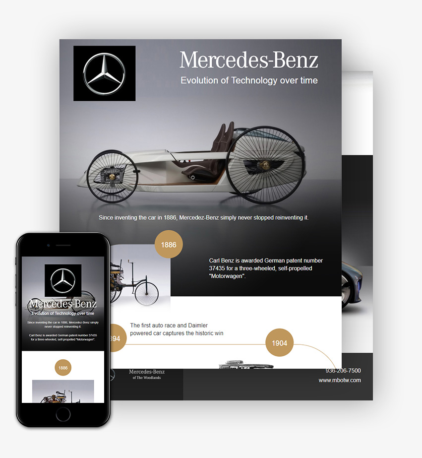
Check with your designer if the infographic created is mobile responsive and SEO-friendly to save yourself a lot of trouble. With mobile-first being the trend in the industry, you must ask your designer if they can convert infographics into a mobile responsive design via HTML so Google crawlers can read through the text. This will also allow your infographics to help you in your SEO efforts. You can use this infographic as an example  and request the designer to check the created infographic on both mobile and desktop.

  1. Beware of Template Based Designs

You must ensure that designers don’t create infographics for you using ready-made templates as that will kill the purpose of creating the infographic in the first place. The real purpose of an infographic is to present information in a unique and customized manner so that it tells your story. The designer should not fit your story in a ready-made template.

With a variety of drag-and-drop infographic builders in the market, designers can take this path. The problem with this is that owing to limited resources and tools, infographics created via drag-and-drop builders are never unique. Most of the infographics end up looking exactly similar and you probably don’t want your infographic to look like it was inspired from your competitors.

  1. Integration with Existing Systems (HTML, WordPress, Unbounce)

Before you go ahead with a designer, you must consider whether or not the infographic created is good enough to be part of your website or marketing plan? Can it be sent as a landing page using Unbounce or can it be part of your WordPress website ? You must consider if your infographic falls in line with your marketing efforts and if it be integrated with your existing brand guidelines?

  1. Experience with Infographics & Success Stories

How can your designer guarantee that the infographics they create are liked by your target audience? Truth is, they can do no such thing, however, they can provide you with proof of past success which can back up their claim. For example, infographic resume for Ben Fisher is an infographic that has been featured at various places across the web and is liked by many. You can also ask designers for their work experience, portfolio and the names of the brands they have worked with in the past.

The number of infographics worked on is also a good decisive factor when selecting an infographic designer. A designer with more than 1000 infographics designed can be considered to be a safe choice.

  1. Cost

You may wonder if an infographic designer will charge more if they have worked for big brands in the past. In order to get an idea, we will provide you with an industry cost of a basic infographic so you can negotiate better. For example, a static infographic for approx. 700×3000 px like this one should cost you around USD 200-300 depending upon the volume and timeline. The price will however increase with additional features like animation, mobile responsiveness, SEO-friendly design etc.. However, now that you have a fair idea regarding the cost, you can begin your search and negotiation from there.
Now that you know the points to consider when hiring an infographics designer, you must be ready to go ahead! However, if this seems like too much information you can always hire professional teams to take care of your infographics and other design requirements. When investing your time, effort and money, you must consider whether or not it is all worthwhile. Hiring professional ensures that the work you get is unique and tells your story in the best manner possible. If you want to hire great designers, you can get in touch with The Dreamer Designs , a company that understands all these things in detail and has years of experience in the infographics industry. Chances are that they already have infographics relevant to your business needs.