Tag

Web Designing Company in Delhi

10 ways to improve your user experience using Divi?

By Design
While developing a website, a Divi designer would always consider the users in mind and create a website that satisfies the client and also creates a great user experience (UX). While visiting your website, your visitors must have a great experience, to increase the rate of conversions. This experience will encourage them to re-visit your website and share your website. 
Creating a great user experience requires an expert designer. Thankfully, Divi helps improve the user experience. Divi is a WordPress theme that allows complete customization of the elements in the design. Here are a few things that Divi web designers do to improve the user experience of your website.

Looking to buy your own Divi Membership?

Buy using our link and get one Divi set up, absolutely free!

Get it now!

Or even better,
Save up on much and let us get the work done for you.

Looking to buy your own Divi Membership?

Buy using our link and get one Divi set up, absolutely free!

Get it now!

Or even better,
Save up on much and let us get the work done for you.

Step 1: Optimizing Responsiveness Manually
A responsive website is one that adapts its sizes according to the device’s screen size. Divi is a theme that makes every element you create in your website responsive automatically. This reduces the workload for the Divi designer. Even though Divi makes your website responsive on its own, you should always make sure to manually adjust the elements after test-running the website on various devices. Want to know more about responsive websites?

Step 2: Mobile-friendliness
Following the first point about optimizing the responsiveness manually to fit the screen size of various devices, make sure that your website is mobile-friendly. According to research, websites are visited more using mobile devices. This means that your webpage should not only look nice, function well on a computer screen but also on mobile phones.

Step 3: Testing loading speed
The loading speed of your website plays a major role in satisfying your users. A faster loading website has a higher rate of conversion. Nobody likes to wait around for a website to load. Divi designers test the speed of your website using various tools. Click here to read about some of our favorite tools.

Step 4: Compress images
Images are a great way to capture the attention of the viewer but they take time to load. While adding Images make sure that they are compressed to reduce the loading time. Divi has features that allow you to compress images quickly.

Step 5: Breadcrumbs
This cool element named after the Hansel and Gretel fairy tale, allows visitors to understand where they are on your website. It leaves a trail that they can follow to get back to any layer. Did the term ‘Breadcrumbs’ cause you to fumble a little? Here is a blog that will help you with the terms and abbreviations you need to know.

Step 6: Use post navigation
Blogs are a key element in keeping your website visitors engaged. It adds charms to your webpage. Having blog Post Navigation is a great way to improve user experience. It allows the viewer to navigate through the blogs without having to go back and forth between the Blog page and blogs.

Step 7: Add more white space
Divi web designers make it compulsory to use white spaces or blank spaces in order to avoid crowding. A little goes a long way in web designing. It takes a lot of effort to read a crowded webpage. So increasing the white space allows creating a great user experience.

Step 8: Simplify your forms
Web designers use forms to allow communication between the website owner and the visitors. Keeping the form simple and to the point encourages more visitors to communicate with you. Divi allows designers to simplify the forms easily.

Step 9: Clear CTA
Research says that visitors tend to follow arrows while visiting a website more than any other forms of Call-To-Actions. Divi designers make use of this psychological factor to create a clear and simple Call To Action button on webpages.

Step 10: Micro animations
There was a time when using many animations made your website seem customized. But as a designer let me inform you that, that time is long gone. All these animations did was take up space and distract the viewers. Divi’s animation options allow you to create micro animations that load faster and take up less space. Micro animations add elegance to your webpage and keeping it classy.

Final thought
An amateur designer might be able to create a website. But only a professional can guarantee a well functioning, aesthetically pleasing website, that creates a unique user experience. As a designer with over 15 years of experience, I have learned that creating such website is not an easy task. Luckily, Divi allows complete customization of elements on your website easily. It allows you to create a website that goes well with he brand of the business and creates a user experience that captivates the visitor and encourages them to re-visit.

Have questions or need someone to bring them to reality for you?

We’re ready for anything and everything you require.
Ping us today

Ways you can reach us

We are all ears if you wish to get in touch. Here are several ways you can get in touch with us. We are waiting to hear from you

Unconventional pros of a good design

By Design

Do you realize the intensity of a design’s power? Not often!
Contrary to our general outlook, the primary purpose of a Design is not just to make things look great, it is also to solve things that nothing else can.


That’s right! The weirdest of website issues get solved by the wondrous designs. Whenever a designer floods you with questions about your website, he analyzes the existing backdrops of your business or any other foreseeable ones they could fix with design.

Looking to buy your own Divi Membership?

Buy using our link and get one Divi set up, absolutely free!

Get it now!

Or even better,
Save up on much and let us get the work done for you.

When it comes to things online, designs have an unimaginable scope of power and it’s important to use them for their true potential.
Not sure about what problems it really solves? To name a few, here’s what design solves:

1. Focus on the target audience
A website will let you cater to the whole world, where your design will let you focus on the ones who will relate to your product or service. There is only so much you can do to control the audience of your website. You put in the best wherever possible, to get as much traffic as possible. But are you able to manage to get just the relevant traffic? To cater to those who might be interested in what you’re offering?
Well, this is where design comes in handy. They have the power of making the targeted audience feel like this is what they have been looking for. They can show them how they’re in the right place. Designs can make sure to keep the ones that
right, stick.

2. Overcoming an outdated website
There is a lot that an outdated website brings with itself. Most of these traits play around with the brand identity, which is definitely not good. The first step here would be to bring the website back into its shape before it causes any more damage.
Well, a sigh of relief here can be the potential of design. Redesigning will sort out a lot of things for your website that will automatically improve the user experience considerably

3. Boosting revenue
You can regulate your revenue through websites.There are a few ways in which your website can optimize your revenue or boost them up. While online shops are the most common area, packages increase their scope reasonably. They can be made much more popular through content marketing. Your website can also be used as a platform for advertising. Online payment options, donation programs, and memberships are a few other ways to increase your revenue online.

4. Optimum user experience
Designers understand user experience like no one else. In fact, a good designer bases all of his designs on their impact on the user. He will focus on solving their problems with every element of his design.
But the important part is that designs correlate with user experience. On the plus side, it makes it easier for the designer to fulfill the core purpose of creating a design.

5. Diverse digital identity
A lot of time, a website fails to cater to a segment of the audience, given the priority over another segment. In the case of an NGO, one may cater well to the consumer but may fail to cater well to funding bodies or stakeholders.
Will that hamper the growth of the business? Yes, it will.
It is essential to lay out the goals of every business to make sure every member of the
audience is being taken care of and the website design caters to all of their needs.

Have questions or need someone to bring them to reality for you?

We’re ready for anything and everything you require.
Ping us today

Ways you can reach us

We are all ears if you wish to get in touch. Here are several ways you can get in touch with us. We are waiting to hear from you

Why as a web designer i preffer divi?

By Design

Ever since it was introduced back in 2013, elegant Themes have constantly updated and improved Divi. I started using Divi 3 years ago, and if you had told me then that, in 2021 I would be writing about why I prefer it over anything else, I would not have believed them.


As the owner of a design agency Divi has made it possible to create a versatile design for all my clients. It helped me deliver a unique user experience to all of them. Ever since then, I have officially become a Divi web designer.

Looking to buy your own Divi Membership?

Buy using our link and get one Divi set up, absolutely free!

Get it now!

Or even better,
Save up on much and let us get the work done for you.

Looking to buy your own Divi Membership?

Buy using our link and get one Divi set up, absolutely free!

Get it now!

Or even better,
Save up on much and let us get the work done for you.

As a designer with over 15 years of experience, let me tell you why I prefer Divi design over anything.

1. Easy to work with

Divi has a drag and drop option that lets you move around things on the front end of your website without the complex coding. It also lets you delete elements if they seem out of place.

2. CSS’s control

As a Divi designer, being able to control the visual with my custom CSS is a blessing. Divi provides the freedom to customize every element of the website to the liking of the user.

3. Creating a custom responsive website

Divi has made it possible to create a responsive website easily. It is also possible to customize this responsive website. In my 15 years of career, creating a custom responsive website has never been this easy.

4. Prearranged layout

Divi also maintains regularly updated pre-made designs that come with images, and icons. If our clients prefer a pre-made design, they are still going to have to choose from the amazing designs. Divi adds more pre-arranged layouts every week. The highlight is that the images are royalty-free and the design also has illustrations that can be used.

5. Lets you edit in real-time

Divi lets you edit your website and see it instantly. This helps make the work so much easier. The website visual provided helps you understand and design better.

6. Plugins

To add functionalities to your website, Divi provides various plugins and also supports various plugins. This helps create a well-tailored website. Click here to read more about using plugins to enhance the performance of your website.

7. The support they provide

Being a Divi partner has given me plenty of advantages. The biggest among them is the support they provide.

Using Divi to create your website is easy, but sometimes you might miss some minute details that make a huge difference for your website. This is why you always need an experienced Divi designer to do it for you. From finding the right plugin for you to understanding what would work well aesthetically and functionally, a Divi web designer can bring your website to great success. If you already have a website theme you are happy with, you can add a Divi builder plugin that would enhance the performance of your website.
Curious to know how? Contact us to find out.

Have questions or need someone to bring them to reality for you?

We’re ready for anything and everything you require.
Ping us today

Ways you can reach us

We are all ears if you wish to get in touch. Here are several ways you can get in touch with us. We are waiting to hear from you

Sit back and let these navigation tips take your website up a notch

By Design

The navigation on your website might not be the center of your concern generally but it’s not something you can let by just like that. It might not be something that has focus but being careless with it could cost you much more than you can probably fathom.


There are several faults that come with a weak website’s navigation that are more common than you may think.
A potential client may fail to realize your offer or lose trust in your product. The audience may fail to grasp the purpose of your business.
I bet you these probabilities scared you!


And yes, this is what comes along with faulty navigation on a website.

The navigation is not only an integral part of your website but it adds to your impression of that world. Its role in user experience makes it all the more important to keep it top-notch.

If you are not sure, you can get a review by experts at The Dreamer Designs.

Get your website audit done for FREE by a member of Young Jury at AWWWARDS

Yes! I want free web audit

If you are not sure, you can get a review by experts at The Dreamer Designs.

Get your website audit done for FREE by a member of Young Jury at AWWWARDS

Yes! I want free web audit

Well, you can stop worrying now because we have handpicked tips for you to keep the navigation on your website flawless:

1. Keep the essential links only

You certainly don’t want your potential client to feel bewildered on your website, do you?
It’s better to keep the number of links on your website limited and relevant to keep them interested and sorted.
According to the average memory span of a human mind, it can hold 7 things in a mind at a time. Hence, it’d make sense to keep the number around that only.

Also, the minimum usage of words would help them retain the information. It’s a great trick to cut down on irrelevant words or words you can do without.

2. Focus on usability

Agreed, your website has got to look pretty to retain attention. But that is definitely not it. After getting attracted to it, the user looks forward to a great experience and looks forward to easily attaining what he’s there for.

Your website is a hit when it not just looks good but also takes the user where he needs to be and does not make it seem like work at the same time. It’s that seamless experience that’ll pay you off later.

3. Let utility bars sort things out

If it’s really necessary to put many links, it’ll be better to categorize them based on the required attention. Secondary links can be put on a utility bar.
It’s the perfect place for links like faqs, contact links, etc.
A utility bar successfully divides emphasis between the main links and the secondary ones, without overwhelming the audience.

Anyhow, utility bars are not as common as they are useful.

4. Keep the terms simple

Navigation is highly affected by your navigation items. A user will feel hindered while going to a link he’s not sure of what to expect.

Hence, it’s a great idea to keep the names of the navigation items simple. And, keeping it less wordy will make them more understandable as well.

5. Accessible path towards CTA

All of the hard work done on a website comes down to this. Does the user respond to your call to action or not?
It’s a given that your CTA should look accessible and something that the user can relate to or what he has been looking for. The navigation becomes flawless when the user knows what to do next every step of the way and reaches the CTA, seamlessly.

And this is it! The unbeatable tips for flawless navigation.

This is what you got to implement on your website and turn the game upside down.

Have questions or need someone to bring them to reality for you?

We’re ready for anything and everything you require.
Ping us today

Ways you can reach us

We are all ears if you wish to get in touch. Here are several ways you can get in touch with us. We are waiting to hear from you

A Divi web designer’s guide on what not to expect from Divi

By Design

Unlike other WordPress themes, Divi is a design framework that you can customize every aspect of your WordPress website.


It lets you control every minute part of your website to create a design that you’re most satisfied with, and to create such a website you will be willing to pay a reasonable amount of money. But let us warn you not to go into it expecting the supernatural.


Just like every technology, Divi has its limits and you need expert help to make things work in your favor keeping these limitations in mind.

Looking to buy your own Divi Membership?

Buy using our link and get one Divi set up, absolutely free!

Get it now!

Or even better,
Save up on much and let us get the work done for you.

Looking to buy your own Divi Membership?

Buy using our link and get one Divi set up, absolutely free!

Get it now!

Or even better,
Save up on much and let us get the work done for you.

Here are a few things that you should not expect from Divi according to an expert Divi web designer.

1. Do not expect the work to be done on its own

Divi is one of the best WordPress themes out there that help you customize your website. Just because you implemented Divi, doesn’t mean your Divi web design would be perfect for your brand. You will need expert help to customize your design and you need to communicate with your Divi designer on what all needs to be done in your design.

2. Do not expect your website to be SEO optimized on its owns

Having Divi does not mean that it will do everything needed for your website. You will have to sit down with your designer and get your website SEO optimized. Optimizing your website will bring more traffic to it.

3. Do not expect perfect animations for your brand

Implementing Divi doesn’t mean your work is done. The animations and effects that go into your website all need to customize with the help of a professional Divi web designer. Divi would not recognize what you want and do it for you, it only provides an opportunity to customize it.

4. Do not expect Divi to come with images and graphics

Images and graphics play a vital role in your website design. When you choose Divi as your website theme it gives you the flexibility to customize it to your taste. Adding images that represent your brand is necessary for a well-customized website. But do not expect Divi to provide you with images. You will have to buy stock image services that will provide you images that would go hand in hand with your brand. But buying a stock image bundle to use only one or two images might seem too much. This is where you need an expert Divi designer who would already have access to stock images. This would cut down unnecessary.

5. Do not expect an all-rounder

Divi is not an all-rounder. Sometimes to perform certain functions you will have to use a plugin. WordPress supports a lot of plugins that provide various functionalities. To find out which plugin to use for your Divi web design, ask your designer and they will know the perfect one for you. Click here to read about our favorite WordPress plugins and the reason behind them.

6. Do not expect auto fitted analytical skills

Divi does not come with the capability to collect data and analyze them. Analyzing data is required for the success of your website. It is highly necessary to add this feature to your website with the help of your Divi designer.

7. Do not expect it to be easy to create a website

Even though Divi lets you customize your theme easily, the creation of a website in itself might be a bit difficult. It is easy to handle your website with the help of Divi for sure, but creating it would require a professional designer who would know what they are doing. If you are thinking of using Divi as your website theme do make sure you have an experienced designer who knows how to work with Divi.

The takeaway

Divi is one of the best WordPress themes out there that lets you customize everything in your website to suit your brand and purpose. But never go into it expecting the best thing that has happened to mankind. Technology has its limits and can only perform well with the assistance of a human. When it comes to dealing with web and graphic designs it is always better to leave it to the hands of experts. They would know exactly what to do to make the website work exceptionally well, without leaving any gap for errors. As a well-experienced Divi designer with over 15 years of experience, we have always made sure to give our clients the best services when it comes to Divi web design customization. We provide plugin services, stock images, and above all customer satisfaction.

Click here to contact an expert Divi web designer!

But that’s not it!

Go ahead and get a no obligation, absolutely free 20 minutes one-o-one discussion with our experts and get your answers.

Ways you can reach us

We are all ears if you wish to get in touch. Here are several ways you can get in touch with us. We are waiting to hear from you

Know your Audience: the key to a successful presentation

By Business, Design

Have you ever given a presentation where your audience looks lost?

We have all been there. That moment when the audience looks lost and you can’t figure out the instant that caused it. Even though you feel your presentation going down, you have to carry on.

You work so hard while pitching an idea to your clients, from spending all nights at work to keeping every detail on point.

  • Where does it go wrong?

  • Where do we lose them?
    With every information right, if it fails to reach the client, it’s probably because you didn’t analyze your audience first. And, that changes everything.

Whenever you present, you want the clients to relate to your message and react favorably. With this one-sided communication, it’s difficult to create a balance in the information delivered. You don’t get instant feedback, it’s just their facial expressions that give you the hint.

You make presentations when the stakes are high. You get amazing content, interactive slides and you know what you’re talking about. But somewhere along the way, you get derailed. As demotivating it may be, we have all been there. And if that doesn’t make you feel better, the solution to it definitely will.
The key to rock your presentation is to know your audience.
You do that, you’ll win them over for sure.


Yes, giving them the right information and reason to agree with you is the most logical way to go about it. You would question the relevance of knowing them

Have you ever been to a doctor where he explained what you’re feeling better than you did yourself?How did that make you feel?


You felt understood. You felt like he connects with you and he knows what he’s talking about. And right at that moment, you feel great about choosing that doctor.
That’s exactly how your clients should feel after listening to you. They have to know that you understand their problem and have the perfect solution as well.
With that, knowing them will make it easier for you as well.

Here’s why you should know the audience you’re presenting to:

1. Figure out what they want to hear

What would be better than telling them what they want to hear? There’s no better trick to convince them you’re on their side than talking about their benefit.
Saying the right things will get you where you intend to reach.
But what is worse than not saying the right things?
Saying the wrong things!
You need to know your audience enough to make sure your content doesn’t hurt their beliefs or offends them anyway.
Understanding them layout a plan for your presentation. It’ll give direction to your content.
It’ll be something they’ll connect to and will get engaged.

Isn’t the intention to make them stick? This is the way to go!


2. Set the proper tone

What do you base the tone of your presentation upon?
What you would want to hear or what your audience wants to hear?

It’ll only be a success if you go by the latter option.
It’s a critical task to set the tone. Especially when your audience has multiple people of mixed genders, different positions, different experiences, different educational backgrounds. These factors will alter how they perceive your tone.
It makes it more essential for you to choose a tone that runs common for your audience.


3. Find a way to connect

It is important that your audience connects with you on some level. Finding a common ground will lift the uptight situation there. It’ll ease you into explaining your point and will also make it easier for them to put up questions without shying away.
The more questions they ask, the more opportunity for you to make things clearer and convince them.
It’ll also let you align your message with what your audience believes in. Let’s say your audience believes in numbers. It’s your cue to give them data and let them believe what you’re saying.


4. Proper approach

Given the limited chance for communication, you might not be able to come back to a point and clarify it for them. To avoid the need for that, your presentation needs to be audience-oriented. It has to be planned in a way that your audience understands easily.
Knowing your target audience will do that for you. You will have to speak their language and anticipate what they would want to hear. Along with that, your presentation shouldn’t say that you’re pitching your idea. Rather, it has to make them believe that your intention is to solve their problem with your idea.

If you are not sure, you can get a review by experts at The Dreamer Designs.

Get your website audit done for FREE by a member of Young Jury at AWWWARDS

Yes! I want free web audit

If you are not sure, you can get a review by experts at The Dreamer Designs.

Get your website audit done for FREE by a member of Young Jury at AWWWARDS

Yes! I want free web audit

Want to get your hands on such an unbeatable pitch? You’re at the right place already!

Go ahead and get a no obligation, absolutely free 20 minutes one-o-one discussion with our experts and get your answers.

Ways you can reach us

We are all ears if you wish to get in touch. Here are several ways you can get in touch with us. We are waiting to hear from you

The outdated website brings you down!

By Business, Design

The virtual world is ever-evolving and as dynamic as it gets. There are new trends everywhere every day. Is it everyday things get updated? Sure, it is! It all moves so fast that it’s a task in itself to keep a track of everything.


It’s a given that those of us who want to maintain a social presence will have to move alongside it. We can not be left behind or it’ll cost us well. Being dynamic is the key to success today. Almost every business in every corner is taking advantage of the online market. But is everyone excelling as well? Truly, only those who are changing digitally every moment are the ones making good use of it.    

Every business has a website but what good is it if it’s stagnant?

Merely having a website doesn’t count for it if it doesn’t serve the users well and gets your business running.

Once you have gotten your website, it’s not the time to stop there. You can’t depend upon it to keep you good for a long time. It’ll have to develop every day to keep you at the top of your game. Every element will have to be updated as per the needs. From designs to content to user experience, everything has to be perfect.
You must consider the development as a life cycle for a website and it needs to grow to reach its full caliber. An updated website won’t be ranked high on search engines and won’t be able to seek the attention of the audience.

  • Without getting it to fulfill your basic needs, how do you expect it to create a brand image for you?

  • Wasn’t that your idea of having a website? And even if you keep your website stagnant, do you think it does not affect it at all?

  • If not positive then not negative either?

We wish it were true but it’s not. You cannot imagine how your outdated website costs you without you even realizing it.

If you are not sure, you can get a review by experts at The Dreamer Designs.

Get your website audit done for FREE by a member of Young Jury at AWWWARDS

Yes! I want free web audit

If you are not sure, you can get a review by experts at The Dreamer Designs.

Get your website audit done for FREE by a member of Young Jury at AWWWARDS

Yes! I want free web audit

It literally puts in your first impression in the world and yet, it is not the best version of itself. You may think you’re saving up on money by not investing in your website but here are all ways your outdated website is costing you:

Loss of sales

Today, everyone is looking for the latest in every aspect and your website has the role of representing your modernity and your will to match the latest standards. People are not going to deal with you if your first impression doesn’t suit their needs. An outdated website will show them your lack of evolution and how you haven’t met the latest technology trends or social trends. Even though your product may be all modern, it’s representation should match it as well.
Outdated websites tend to impart incorrect information as well. It can lead your potential customers to perceive a negative image. When the website should represent your best features, it’ll be enhancing the opposite and you definitely want to change it promptly.
Your website should reflect what you actually offer. The representation should be accurate.


Limited reach

In simple words, if your outdated website lets you entertain an audience of thousands of consumers, an updated one will increase that by at least 10 times. The reach of an outdated website with zero digital engagement or any social media optimization strategy will be hampered. Without any effort to make it optimum, it’ll start to create a negative impact on the audience.
The constant presence digitally tends to promote your reach.


Weak mobile compatibility

Today, people access everything on their phones. If you’re trying to get their attention, make sure it can be done through their mobile phones.
Everyone looks for information on their mobiles, shops on their mobiles and if you wish for them to become your consumer, you have to make sure it’s feasible for them.

Most of the outdated websites are not mobile-friendly, killing half of the audience right there.


Weak user experience

Any user will not stick to a website with glitches or not smooth navigation. The users are supposed to have a smooth experience and are supposed to want to navigate through your website. But if there are any glitches or a page doesn’t load, it’ll make them leave your website completely.
With everyone’s busy schedule, their experience has to be prompt. If it’s a smooth ride for them, they’ll end up buying your product. But if they face problems at the checkout page, they might just leave right there.


Weak brand identity

Is your website representing what you stand for?
When people visit your website, they’re looking for an insight into the brand. They’re looking forward to knowing what the brand represents.
Your website should aim at making people connect with your brands. Every element must have a role to play in it. Your brand journey, your identity are few things an updated website represents.
If it doesn’t make you stand out, if it’s just about fonts and graphics, it might not work.
Still a little confused?

Convert your outdated website into a modern one and not let it cost you in any way!

Confused about how to proceed further? We might be able to help you out through it.
Connect with us on a call and leave the drawbacks of your website behind.

Yes! I want free web audit

Still a little confused?

Convert your outdated website into a modern one and not let it cost you in any way!

Confused about how to proceed further? We might be able to help you out through it.
Connect with us on a call and leave the drawbacks of your website behind.

Yes! I want free web audit

But that’s not it!

Go ahead and get a no obligation, absolutely free 20 minutes one-o-one discussion with our experts and get your answers.

Ways you can reach us

We are all ears if you wish to get in touch. Here are several ways you can get in touch with us. We are waiting to hear from you

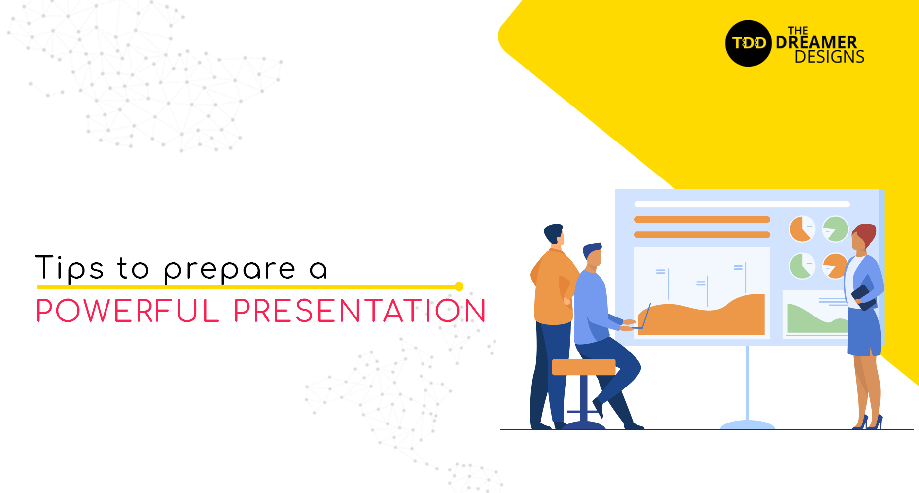
Tips to Prepare Powerful Presentation

By Design

PowerPoint presentations have taken over the business world. It has gotten so far that a PPT can make or break a business deal. Why does PowerPoint presentation hold so much power? Is it due to its ease to edit, add images and ease of usage? Or is it because of how a PPT can grab the attention of your audience and keep them engaged?


It is probably due to all of the aforementioned facts. But how do you make sure your presentation has set the deal in your favour?

Here’s a few tips that you can use to prepare a powerful business presentation.

1. Keep your presentation consistent.

Elements such as the font, colour and background could be consistent no matter what the content is. For this purpose, a slide master could be used. 

2. Keep it simple.

While preparing a PowerPoint, being tempted to add a long paragraph is normal, but remember, keeping the words to minimum and adding only the important points is the right way to go about it.

3. Keep it formal.

Using animations and sound effects may seem interesting, but overdoing this may result in you not being taken seriously. 

4. Limit the number of slides.

Imagine, attending a conference, where the presenter constantly flips the slides. He is sure to lose his audience after a couple of minutes. Make sure to keep the number of slides to absolute minimum so as to keep the audience present. 

5. Ensure visibility.

Now this is something that never seems to go right. If you have a large audience, making sure that the slides are visible to all your audience is hard without seeming loud.

6. Personalised template.

Templates that are provided by the presentation software forces you to depend on the template made for someone else. These templates might not put light on your business brand. Using personalised templates is a great way to leave a good impression.

How to ace your presentation

Now that we talked about the basics of making an impactful PPT, let’s talk about how to ace the presenting.

Presentation is for the audience.

Something that happens to even the most experienced presenter is reading from the presentation. What needs to be kept in mind is that you are presenting for the audience and not for yourself. Practice until each slide acts as a prompt for the presenter.

Do not turn your back.

The audience is not here to watch the back of your head. Never turn your back towards the audience. Sometimes, this can distract your audience and ruin the purpose of the presentation.

If you are not sure, you can get a review by experts at The Dreamer Designs.

Get your website audit done for FREE by a member of Young Jury at AWWWARDS

Yes! I want free web audit

If you are not sure, you can get a review by experts at The Dreamer Designs.

Get your website audit done for FREE by a member of Young Jury at AWWWARDS

Yes! I want free web audit

In recent times, presentations have been the IT factor of achieving business deals. A well prepared PowerPoint presentation can give the impression that you are well put together and ready to tackle any mishaps that might come your way. Though PPTs are a necessity to convince your clients, preparing beforehand and having a clear idea about what needs to be done in times of adversities should be prioritized.


Remember, a well prepared PPT and a straight head can make even the babies understand your business proposal.


Happy presentation!!

Ways you can reach us

We are all ears if you wish to get in touch. Here are several ways you can get in touch with us. We are waiting to hear from you

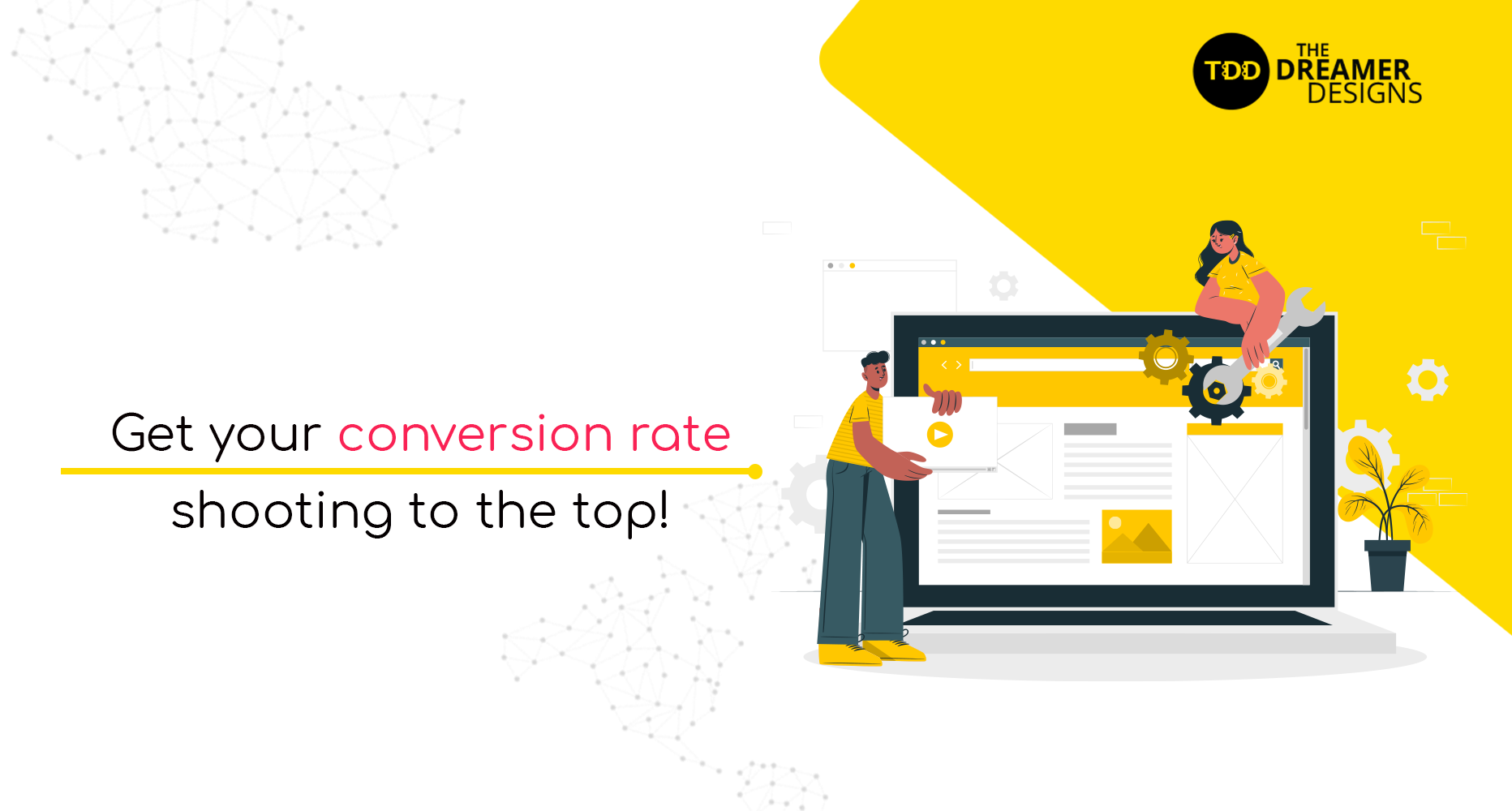
Get your conversion rate shooting to the top!

By Design

What good is a landing page that doesn’t convert? It simply nullifies the whole purpose of having one in the first place. The power of your landing page lies in its perfection that comes over time.


You ought to work on it until it becomes the perfect tool to engage your potential clients, convince them, and convert them!

Targeting one such landing page? Here are a few tips you wouldn’t want to miss to get that:

1. Clear offers

A client will respond to an offer he’ll understand completely. Until he has any doubts in his mind, he’ll not agree to pay up. Hence, it becomes essential to make sure your offers are clear with understandable language.
The client must feel good while taking you up on your offer and most not have any doubts about it. He must feel that it’s a smart and wise decision that he feels good about.

2. Simplify your landing page

Except for the content, there’s a whole world of elements on a landing page. It’s extremely important that it looks systematic instead of looking like a cluster, piled upon each other.
It falls upon the designer to find the perfect place for every element.

3. Gripping to a color theme

It’s very often that we find color themes becoming brand identities. We see red and yellow, we immediately connect it with McDonald’s. That’s exactly what happens by sticking to colors.
The composition of colors on your landing page somehow represents your brand identity and lets the consumer relate to you. Every important element should look like it belongs to you.

4. Don’t divert the focus

If a person has reached your landing page, he has already shown interest in your offer. After that, mention of anything else might confuse him. The first thing he has to see on the landing page is the offer he came for. He needs instant assurance that he is on the right page.
Don’t we always focus on the main part? That’s exactly what we need to do with our landing page. Once he sees the offer he’s there for, he can scroll down for more information on it.

5. Use scarcity techniques

Didn’t you just attend that sale that’s ending in 2 days? Thank God you didn’t miss it!
That’s the urgency you need to create on your landing page. The client doesn’t have to feel that he can come and avail of the offer at any time. He needs to know that he might just miss it.
Words like ‘Hurry up’, ‘Limited period offer’, or ‘Only for 10 first applicants’ might do the trick for you.
The mention of scarcity on an offer will turn it into a magnet and will create urgency among the clients to avail of it.

6. Straight forward Call-to-action buttons

Call to action buttons is where they actually convert. Those are the elements that lead them to take up your offer.
With such importance, they can not be confusing in any way. They have to be as clear as a crystal. They must state the offer clearly without creating any questions in the head of the audience. They should make it very simple for them to avail of your offer.

7. Contact details

It’s very essential that your potential clients know how they can reach you. There are various options to be used. Email address, social media links, contact number are some of the very common ways used.
Providing such details will not only give them a way to connect with you, but it will also establish a sense of trust in you.
This is a tip you cannot miss.

8. Don’t settle with headlines or content

What lets a person click on a simple link? It’s an intriguing headline that doesn’t let the person ignore it.
If that’s the case( which it is), why would you settle with a headline that doesn’t assure creating much interest for the audience to visit your page? That would be a huge mistake.
You must have various options while deciding upon a headline and go for the one that is the most intriguing.
But when a person reaches the page, it’s not just about what’s written. It becomes about how! Make sure that it connects with your target audience.

9. Be consistent

A person might reach your landing page through a Facebook ad, a LinkedIn post, or any email. If he doesn’t find any similarity between the landing page and what led him there instantly, he might get the idea that he’s in the wrong place.
You have to be consistent with how you present your offer on various platforms. There should be a similarity between the elements used on every platform.
In simpler words, it should create a similar visual impact on every platform.

10. Add proofs of your worth

10. Add proofs of your worth

Whenever we go to a restaurant, we always check its reviews to see if it’s worth it or if it serves our favorite cuisine. It works the same for your clients.
Tokens of appreciation from your existing clients will serve as pieces of proof for them. It’ll lead them to feel confident about you and your offer. They’ll definitely feel that your offer is worth paying the money.
With many creative ways to put up testimonials, you can decide which one suits your need the best.

If you are not sure, you can get a review by experts at The Dreamer Designs.

Get your website audit done for FREE by a member of Young Jury at AWWWARDS

Yes! I want free web audit

If you are not sure, you can get a review by experts at The Dreamer Designs.

Get your website audit done for FREE by a member of Young Jury at AWWWARDS

Yes! I want free web audit

Ways you can reach us

We are all ears if you wish to get in touch. Here are several ways you can get in touch with us. We are waiting to hear from you

Terms and abbreviations every website owner needs to know.

By Design

Sometimes the jargon and all the technical terms can be quite confusing. If someone told you to click on the hamburger menu, you’d probably stare at them dumbfounded. Worry not.


Today we are going to talk about all the terms and abbreviations that every website owner needs to know.


If you are a website owner or anybody curious about all the terms your designer friend threw at you, read along.


Let’s begin with the very basics.

HTTP/HTTPS

Hypertext Transfer Protocol/ Hypertext Transfer Protocol Secure, an abbreviation we are all familiar with. When you search for something on a browser, your browser sends a request to the webserver looking for results. More like sending a search party(HTTP) looking for something you want to find. HTTPS is a more secure version of this. When the webserver finds the result it transfers it to your browser. If it is not found, then your search party will come back with 404, which leads us to the next term. Secure Socket Layer(SSL) is the new industry standard and with the latest updates for Google, it is practically impossible for a website to look good without SSL.

404 Page Not Found

When you browse for a page that does not exist, a page containing the message 404 Page Not Found will be shown to you. For instance, somebody searches for “yourwebsitename.com/whatever” and a page called “whatever” doesn’t exist, a message with 404 will be displayed. Website owners can use this to redirect the users to relevant pages.

CSS

Cascading Style Sheets is a mechanism that is used in HTML to add various styles to your website. Using CSS, fonts, colors, and spacing of the content can be styled in a web document. Next time you look through a website and find something pretty, you can tell your friends that it is done using Cascading Style Sheets.

HTML

Hypertext Markup Language is a language understood by a computer, used to create web documents that will be accessible through the web browser. The basic coding of HTML is pretty simple, but to create a well-made web page using HTML with the help of CSS and other codes require expert knowledge.

CTA

Call to Action is a stimulus that the audience can use to act. A clickable URL, that will take the audience to the next step is called a CTA. Like the name implies it calls the browser for the next action.

Hamburger Menu

It is not what you’re thinking. Haven’t you seen that three lines stacked on one another at the side of a website? You click on this and all the options pop out. Yep, it’s not called three lines on the left side. It’s called the hamburger menu or hamburger icon. Now that you think of it doesn’t it look just like a hamburger?

Breadcrumb Navigation

When you visit a website and click on a CTA in it and are taken to a completely different world inside the website, you might start getting dizzy about where you are. Breadcrumb navigation is a graphical control element that helps you navigate easily inside a website.

Landing Page

A landing page is where you land by clicking on a search engine optimized search result or the link you clicked on from a promotional email you received. This is usually a single web page.

If you are not sure, you can get a review by experts at The Dreamer Designs.

Get your website audit done for FREE by a member of Young Jury at AWWWARDS

Yes! I want free web audit

If you are not sure, you can get a review by experts at The Dreamer Designs.

Get your website audit done for FREE by a member of Young Jury at AWWWARDS

Yes! I want free web audit

Ways you can reach us

We are all ears if you wish to get in touch. Here are several ways you can get in touch with us. We are waiting to hear from you